 |
| (Image Source: ABS-CBN.com/Jollibee Group) |
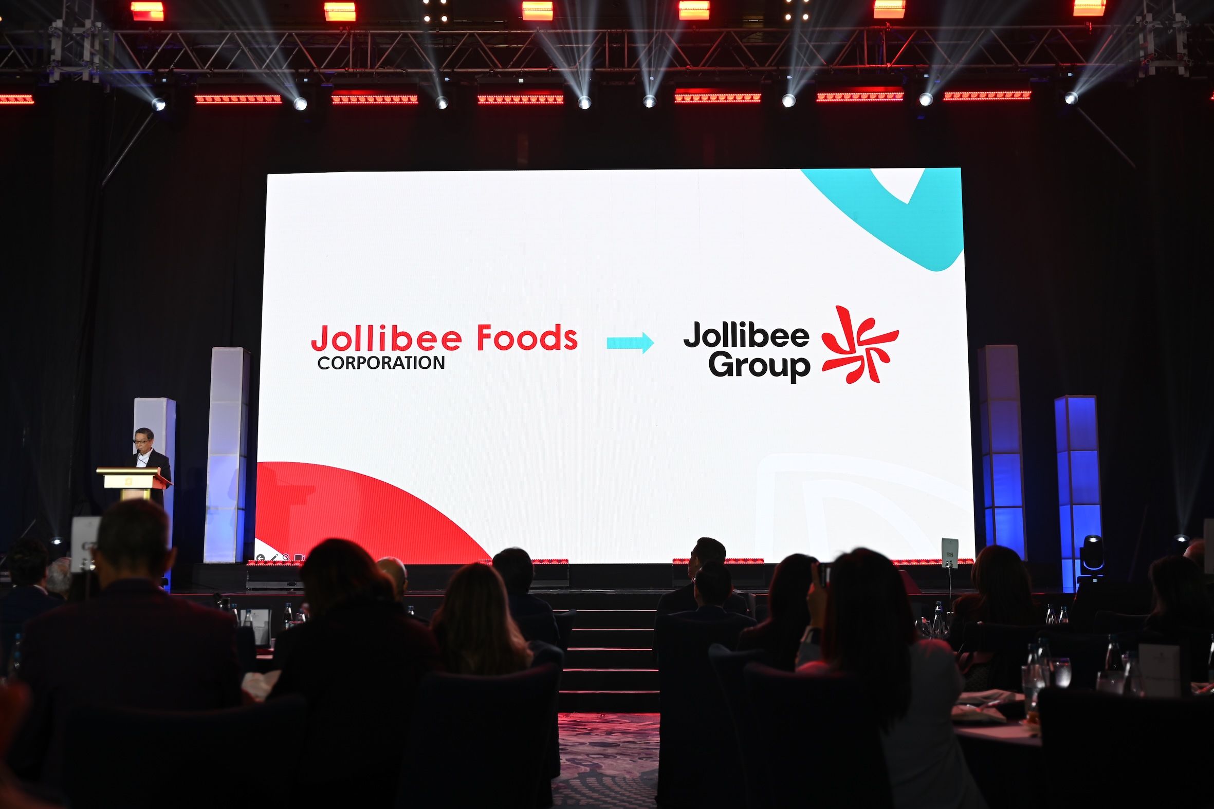
Jollibee Group recently introduced a new corporate logo, a major milestone in aligning the company's global growth strategy with its values and vision. More than a visual update, the new corporate brand embodies the company’s purpose of spreading joy through superior taste and underscores its evolution into a modern, purpose-driven global enterprise. The updated identity brings greater consistency across the company’s diverse portfolio of 19 brands.
At the heart of the new logo is the JoyMark, an icon that symbolizes momentum, movement, and unity. Jollibee Group CEO Ernesto Tanmantiong notes that the JoyMark is tilted at 8 degrees, a subtle tribute to the company’s incorporation year 1978.The shift isn’t cosmetic. It reflects the quiet transformation of a company that has, for some time now, been operating less like a beloved fast food brand and more like a multinational restaurant group with global ambitions — and a growing portfolio to match. Jollibee, in short, is not just Jollibee anymore.
A group, not just a brand
The logo redesign marks a strategic repositioning. The registered corporate name remains Jollibee Foods Corporation (JFC). However, for branding and marketing purposes, it will now be using the Jollibee Group branding in its external communications and stakeholder engagements. This brand evolution also includes a reimagined visual identity, updated brand architecture, and a unified naming convention. This asserts Jollibee's identity as a corporate umbrella — home to more than 18 brands operating in 34 countries. This includes familiar Philippine names like Chowking, Mang Inasal, Greenwich, and Red Ribbon alongside international acquisitions and partnerships like The Coffee Bean & Tea Leaf, Smashburger, and Tim Ho Wan. Also worth noting: recent ventures into foreign markets have seen Jollibee’s signature chicken outselling some legacy Western brands in their own backyard. The new logo formalizes what the business reality has already made clear: Jollibee is no longer a single brand. It is a holding company, a portfolio player, and increasingly, a case study in how to scale a food business beyond borders.
A taste strategy
From a food perspective, this expansion is less about synergy than it is about diversification. The group's portfolio spans multiple cuisines (Filipino, Chinese, American, Hong Kong-style dim sum), categories (quick service, coffee, casual dining), and markets. There’s no unifying flavor strategy or culinary ethos tying these brands together — except perhaps an instinct for commercially viable comfort food. That said, one thing the Jollibee Group has demonstrated consistently is how to localize without losing volume. In the U.S., their Chickenjoy now competes head-to-head with KFC and Popeyes. In Southeast Asia, they offer brands that cater to regional preferences. And across the board, they’ve proven that fried, sweet, and saucy still sell — regardless of how evolved the branding gets.
A clearer picture
To most consumers, the corporate logo change will not have large implications. They'll continue lining up for Chickenjoy and Jolly Spaghetti. But for those paying attention to how food brands evolve, this is a useful case study in what happens when a local icon grows into a group with a robust portfolio. A winning one at that.
